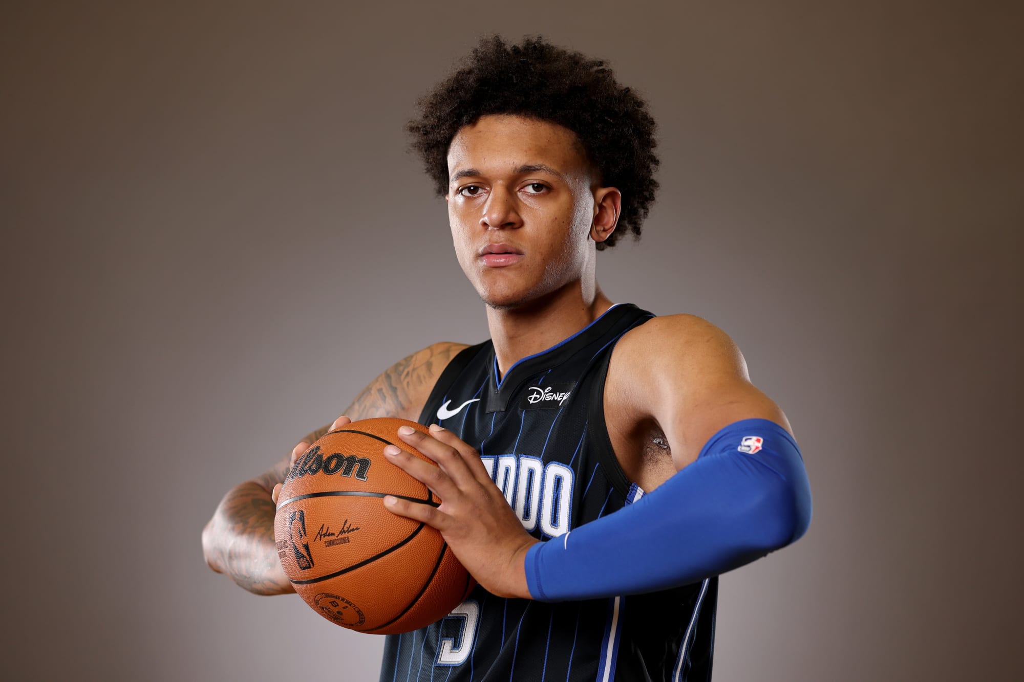
All Orlando Magic fans want is a throwback to stripes. Or rather, to the original jerseys.
Cartoon font. Pinstripes that stood out among other teams in the late 1980s and 1990s. Warm-up jackets (especially road ones).
The whole aesthetic worked. It still works.
Orlando as a franchise will always continue with these uniforms. And even though Nike requires each team to replace uniforms each season, all fans want is a return to those jerseys.
It will not arrive. The NBA’s vague jersey rules — including “classic” jersey rules and logos — will keep the Magic from wearing the original uniforms for a little while. The Magic will celebrate its 35th anniversary next season and now should be the time to open the vault.
Until then, the Magic are bringing back the stripes in blue, with a twist to honor forgotten jerseys from the mid-2000s. If there’s one statement to be made in the Magic’s new “Statement Edition” jerseys, it’s that Orlando continues to embrace its past and give fans clues to what they want.
The Orlando Magic have officially announced a new Statement Edition jersey that blends elements from their past as they prepare for their future.
Despite some early NBA 2K23 leaks (which predictably didn’t do the real thing justice), the Magic released their new Statement Edition jerseys.
The fact that the biggest controversy about them is that the photo lighting made the side panels green (there’s no green in them), seems to make these jerseys a hit.
This may now be the best jersey in Magic’s uniform set (City Edition pending).
For the first time since the 2019 season, Magic will return to wearing blue pinstripe uniforms (in my opinion, the 1995 blue pinstripe alternate uniforms are the best in Magic history, but it’s definitely a debate).
The Magic originally had the blue jerseys as their original Association Edition jerseys when the league switched to Nike. But Orlando preferred black uniforms and began using them as traditional road uniforms.
Eventually, the blue stripes disappeared for different iterations of blue jerseys.
Orlando wore a blue uniform with silver stars on the shorts and a black band with stripes on the pants emanating from the stars on the pants. It was a different, solid look. But it was time to change.
These are not the same blue uniforms that the team wore essentially from the 2009 to 2019 season. Gone is the solid black cutout on the sides. This is not a throwback to the original “New Blue Stripes”.
Unlike the original pinstripe blues the Magic wore in this latest iteration, the uniform features black stripes as opposed to gray stripes. And it’s a much better look.
These definitely look more like the old fashioned pinstripe uniforms everyone loves. Even if they are not exact versions.
The only good thing these jerseys add are the stars on the side.
One of the big design tragedies for the Magic was how they dropped the star from their logo and many of their wordmarks and imagery. So seeing the team pay homage to the jersey of the early 2000s is long overdue.
Having stars back on the jersey prominently is a good thing.
This way, all eras of Magic basketball are recognized – from original jersey stripes to early 2000s jersey stars to modern jersey police. It’s an embrace of Magic history.
Yes, many fans are still upset with the police. The current Magic uniform isn’t the biggest fan favorite. And everyone seems eager to see the team do a bit of a brand refresh (a new Magic Together replacement tagline is expected to arrive this year).
It’s not in the cards yet. For now, the Magic is releasing a jersey that encompasses all of its previous eras. And they combined it into something solid.
It remains to be seen if the Magic sticks to the orange theme for a fourth year for their upcoming City Edition jerseys or if something new is on the horizon.

